Brain development over a human’s entire life has been mapped by scientists for the first time. The fascinating series of charts – spanning a 15 week old fetus to a 100 year old adult – was created from more than 100,000 individuals across the world. They track the breakneck enlargement of the organ in the womb through its gradual shrinkage – from our late 20s to old age.
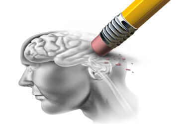
Scientists say the brain development map could lead to better diagnosis and treatment of Alzheimer’s and other neurodegenerative diseases. At-risk older patients could be offered screening.
“One of the things we’ve been able to do, through a very concerted global effort, is to stitch together data across the whole life span,” says co-lead author Dr. Richard Bethlehem, a psychiatrist at the University of Cambridge, in a statement. “It’s allowed us to measure the very early, rapid changes that are happening in the brain, and the long, slow decline as we age.”
It is hoped they will become a routine clinical tool similar to standardized pediatric charts, a cornerstone of healthcare for over two centuries. They are used to monitor the growth of children compared to their peers. There are no such references for measuring age-related brain changes.
The study is a major step towards filling this gap. A lack of tools is particularly relevant to psychiatric disorders and dementia that causes cognitive decline.
“We’re still at an extremely early stage with our Brain Charts, showing it is possible to create these tools by bringing together huge datasets,” says Dr. Bethlehem. “The charts are already beginning to provide interesting insights into brain development, and our ambition is in future, as we integrate more datasets and refine the charts, they could eventually become part of routine clinical practice.”
They could be used to generate “percentage scores” to determine whether an individual is on a standard trajectory.
“These charts – which were separated according to sex – were stable in their predictions, despite specific differences in individuals assessed and techniques and methods used,” adds Bethlehem. “Critical developmental periods – such as an approximate 70 percent brain size increase between the time before 17 weeks after conception and three years of age – were revealed.
“It also enabled the detection of patterns of changes in brain anatomy associated with disease,” he continues. “For example, predictions of a transition from a diagnosis of mild cognitive impairment to that of Alzheimer’s.”
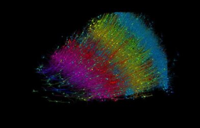
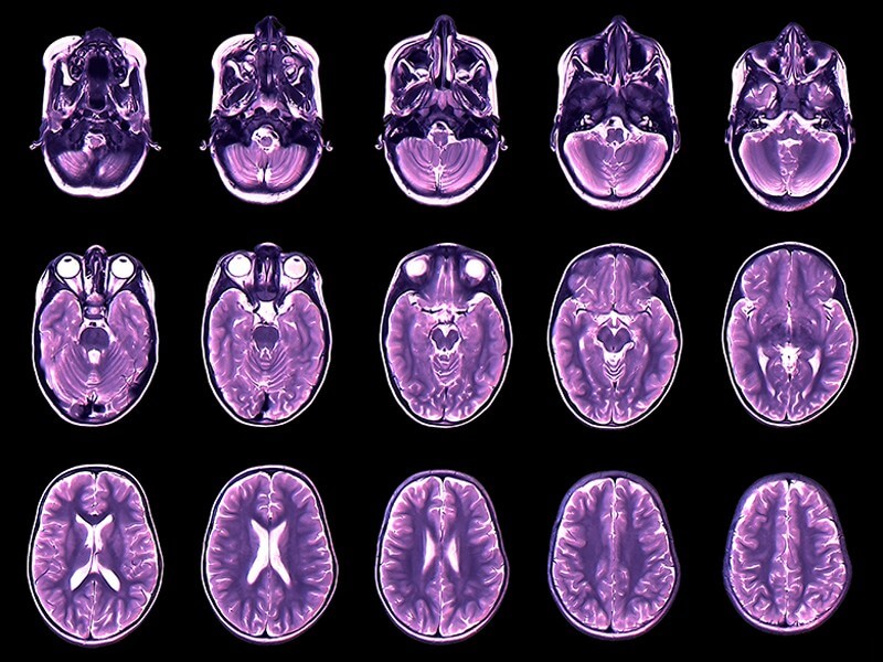
The project traversed six continents – bringing together the biggest ever MRI (magnetic resonance imaging) dataset. It involved almost 125,000 scans from over 100 studies.
“You could imagine them being used to help evaluate patients screened for conditions such as Alzheimer’s, for example, allowing doctors to spot signs of neurodegeneration by comparing how rapidly a patient’s brain volume has changed compared to their peers,” says Bethlehem.
Unlike pediatric growth charts, BrainChart covers the whole lifespan – from the womb to old age. It will shed fresh light on variability among populations. It confirmed – and in some cases discovered – milestones that have previously only been hypothesised. This includes at what age the brain’s major tissue classes reach peak volume – and when specific regions reach maturity.
The study, published in the journal Nature, found the amount of gray matter, or neurons, quickly increases from mid-gestation, peaking just before we are six. It then begins to reduce. White matter on the other hand, that connects the cells, also rises fast from mid-gestation through early childhood, but does not peak until we are nearly 29 years.
Another major milestone is the acceleration of its reduction from the age of 50 onwards. Meanwhile, gray matter in the subcortex which controls bodily functions and basic behavior peaks in adolescence at 14-and-a-half years old.
The datasets already have around 165 different diagnostic labels, meaning researchers can see how the brain differs in Alzheimer’s. It causes neurodegeneration and loss of tissue, so affected people are likely to have less brain volume compared to their peers.
In the same way some healthy adults are tall, so there is variability in brain size. A slightly smaller brain does not necessarily indicate there is something wrong. The charts show natural brain reduction with age, which become much faster in Alzheimer’s patients.
The international team now hope to make the brain charts more representative of the whole population. They point to the need for more MRI data on previously under-represented socio-economic and ethnic groups.
“Creating these brain charts has involved multiple technical feats and a large team of collaborators,” says co-lead author Dr. Jakob Seidlitz, of Pennsylvania University. “With brain imaging data, things are a bit more complicated than just taking out a measuring tape and measuring someone’s height, or head circumference. There were significant challenges to deal with, including logistic and administrative hurdles as well as the huge methodological variability we find between brain imaging datasets.”
Standardized neuroimaging software extracted information from scans, beginning with simple properties such as the volume of gray or white matter. The study then looked at finer details, such as the thickness of the cortex or the volume of specific regions of the brain.
A framework implemented by the World Health Organization for generating growth maps built the charts. It took an estimated two million hours of computing time, analyzing close to a petabyte – 1,000,000,000,000,000 bytes or a 20th of the daily information analysed by Google.
“This really wouldn’t have been possible without access to the High Performance Computing clusters at Cambridge,” says Dr. Seidlitz. “But we still see this as a work in progress. It’s a first pass at establishing a standardized reference chart for neuroimaging. That’s why we’ve built the website and created a large network of collaborators. We expect to consistently update the charts and build on these models as new data becomes available.”
Other researchers and clinicians can adjust their own datasets, making it possible to compare them against the BrainChart population.
“We hope clinicians in future will be able to compare their data against ours and produce a more comprehensive report adding additional objective and quantitative observations to their assessment,” says Bethlehem. “This should effectively allow the neurologist to answer the question ‘this area looks atypical but atypical by how much?.’ As the tool is standardized, it shouldn’t matter where you have your brain scan – you should still be able to compare it.”
The findings have also been published on the open access site brainchart.io
Report by South West News Service writer Mark Waghorn